1 Overview
Role: Content Designer
Timeline: 2 months
Tools: Miro, Mural, Figma, Canva, Microsoft Suite
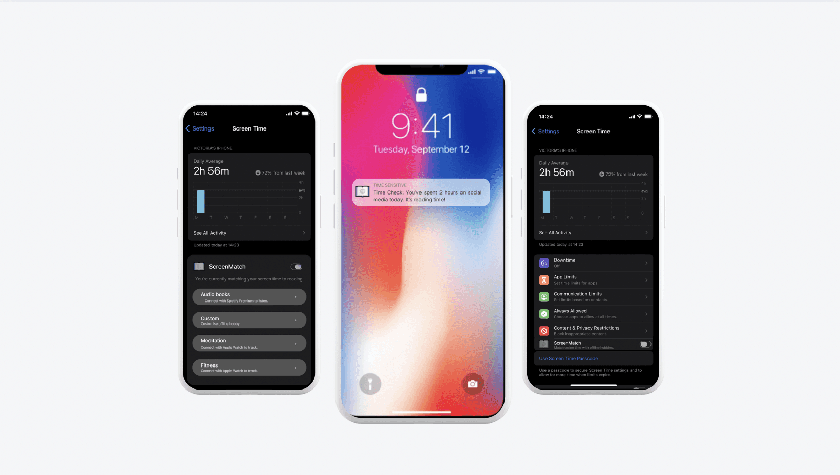
ScreenMatch is designed to help iOS users maintain a healthier balance between their digital and offline lives. It tackles the problem of excessive screen time, aiming to reduce issues like eye strain and headaches. By integrating with iOS notifications, ScreenMatch gently encourages users to take breaks and manage their screen time. Users can choose between audiobooks, meditation, fitness, or a custom offline activity to match their screen time with,
Goal
Enhance iOS notifications, integrate seamlessly with Apple's ecosystem, and empower users to balance online and offline activities by achieving screen time and reading targets, providing personalized recommendations, and celebrating user successes in reducing screen time while maintaining a user-friendly interface for all.
Question
How can we encourage users to have a more balanced digital lifestyle?
My Part
I led all aspects of the project including content strategy, user-research, user-centric messaging, and testing.
Initial Ideation Exercise
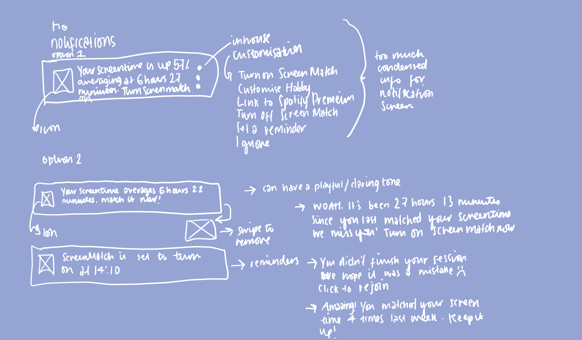
To understand the current iOS notification design and generate new ideas, I used Miro and Mindmup. This involved creating two workflows: one in-depth pink mind map, focusing on screen time issues and iOS limitations, and a high-level blue mind map demonstrating how ScreenMatch improves iOS screen time controls. I also developed an initial sketch to explore diverse design options.


2 UX/UI
Problem Space
Users face an issue of excessive screen time. The challenge is to find effective solutions to reduce screen time without penalising users.
Mental Modes

Content Strategy
ScreenMatch adopts a style that is both witty and chatty, aiming to guide our users without imposing any undue pressure. Our key objectivities are centred around minimizing screen time and granting users the freedom to step back from the online sphere.
Proto Persona
Ivy is a marketing professional who works in a fast-paced tech company. She enjoys outdoor activities like hiking and cycling. Ivy values work-life balance and tries to limit screen time.

Scenario
Ivy struggles with managing screen time during work hours. She finds it challenging to switch from work to personal activities and wants a more balanced daily routine.
Initial Copy & Design

The original Apple Screen Time settings design lacks an option for users to match their screen time. It only allows users to set limits, missing an opportunity to personalize screen time goals to match individual offline habits.
User Research
For this prototype, understanding our users' needs and behaviors has been crucial. I got inspired by YouTube video essays, where booktubers tried to match their screen time with reading. This innovative idea motivated me to create a tool to help users balance screen time with other meaningful activities. I also focused on ensuring users could easily grasp the new feature. I conducted surveys to collect quantitative data on screen time habits, pain points, and preferences.
First Round of Research Findings
During visibility testing, I noticed that a complete redesign of Apple's notifications wouldn't be ideal, as it might confuse users. I also found that users liked a friendly and playful tone in notifications, similar to what Duolingo uses. Many users appreciated the teasing and watchful tone.
How Research Informed My Design Decisions
Users value customization, so I added a customizable tab. I simplified notification text for clarity and a smooth user experience. I made sure the text doesn't judge high screen time. Also, I integrated Spotify, letting users manage their screen time while enjoying audio content. It's a step toward a healthier digital-life balance.
What I Learned
I learned that design involves trial and error. Often, your initial design can be enhanced, and it's valuable to take into account feedback from others. This project also taught me the importance of understanding user preferences and behaviors, which play a pivotal role in shaping the design and functionality of any project.
Product Outline

tap the notification to turn on ScreenMatch.
swipe away to ignore.
Alternate ScreenMatch Microcopy
Progress Alert: You’re 35% through ‘The Paris Apartment by Lucy Foley’ Keep going!
Time Check: You’ve spent 2 hours on social media today. It’s reading time!
Your screen time averaged 6 hours, 43 minutes a day last week. Match it and reduce screen time!
Mood Sync: We've curated a playlist to match your reading vibe.
ScreenMatch Outline in Settings

tap the notification to turn on ScreenMatch.
swipe away to ignore.
Index