1 Overview
Role: Content Designer, UX Designer, User Researcher
Timeline: 1 month
Context: I created an app for global travellers to find and compare exchange rates between different currencies easily.
Tools: Miro, Figma, Canva, JotForm, Microsoft Suite
Problem: Users are busy, on-the-go, and not (typically) keeping the latest Financial Times in their back pocket. Exchange rates are not static; they fluctuate constantly. The currency exchange app market is heavily saturated, and a simple Google search allows users to find exchange rates. So, how can we make our currency exchange app more reliable and accurate for globetrotters?
Solution: I designed a straightforward currency exchange app offering real-time exchange rate updates.
2 Empathise
Meet the users
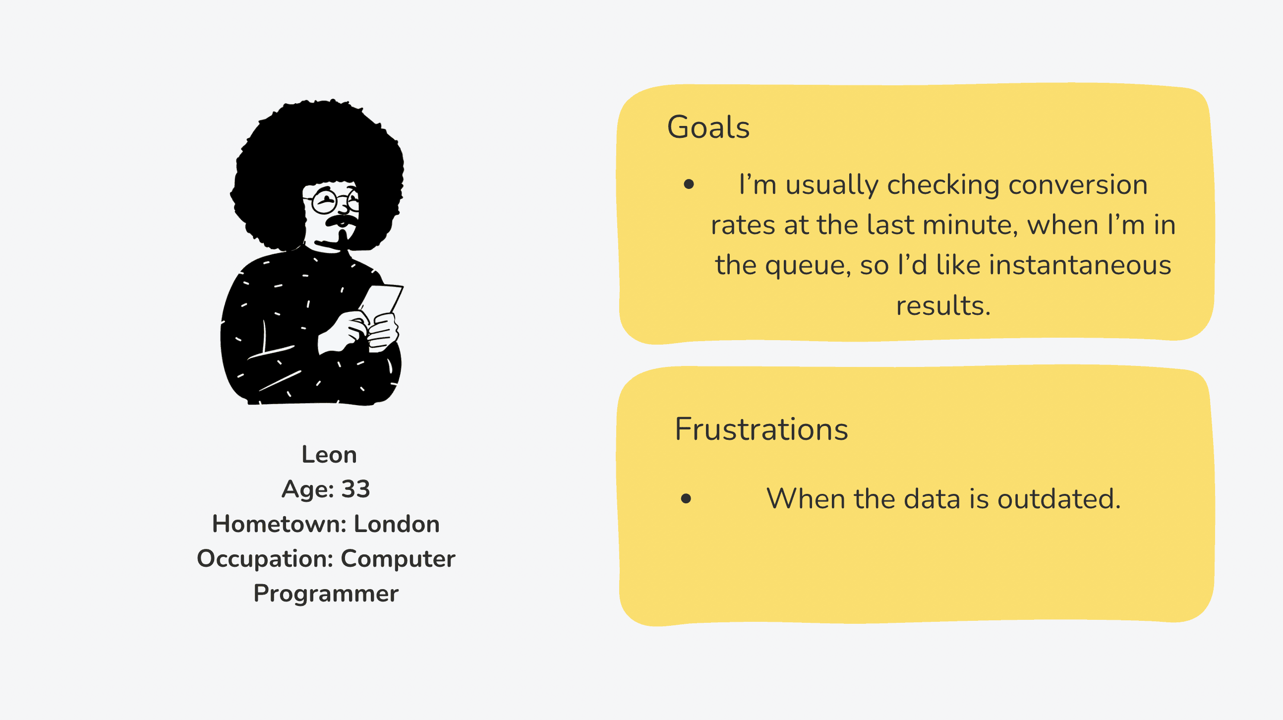

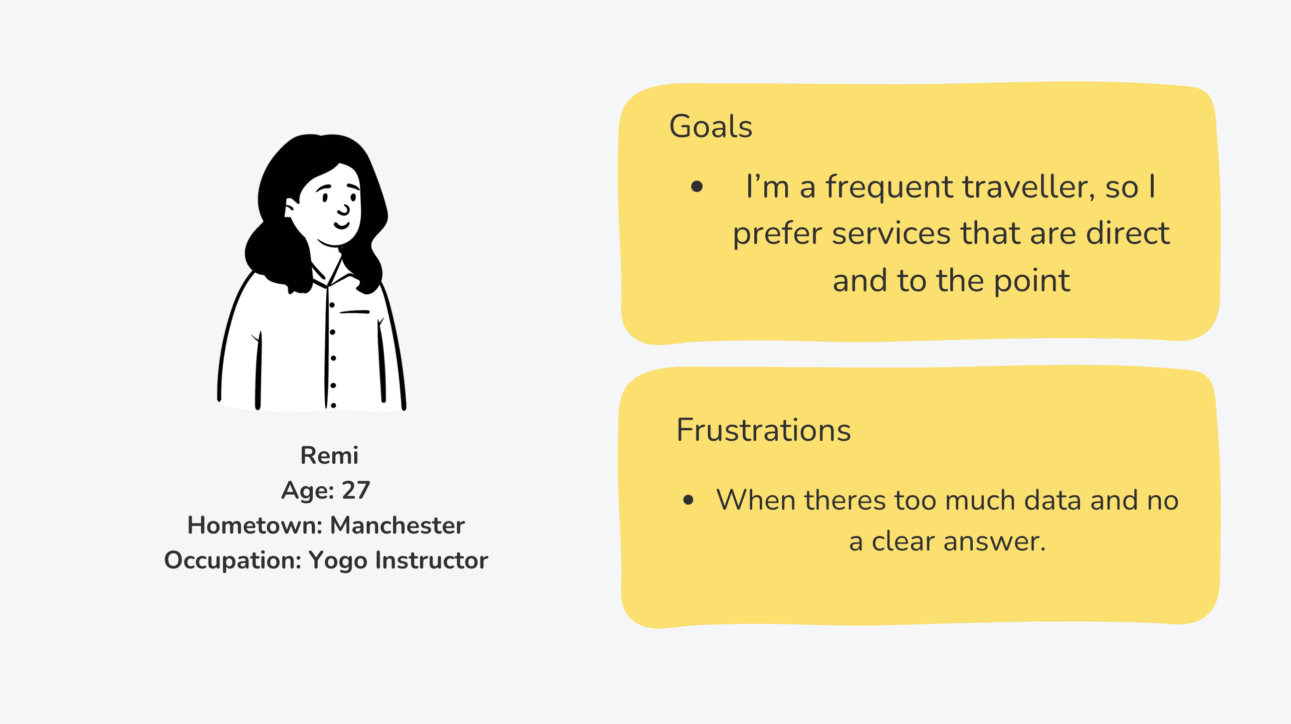
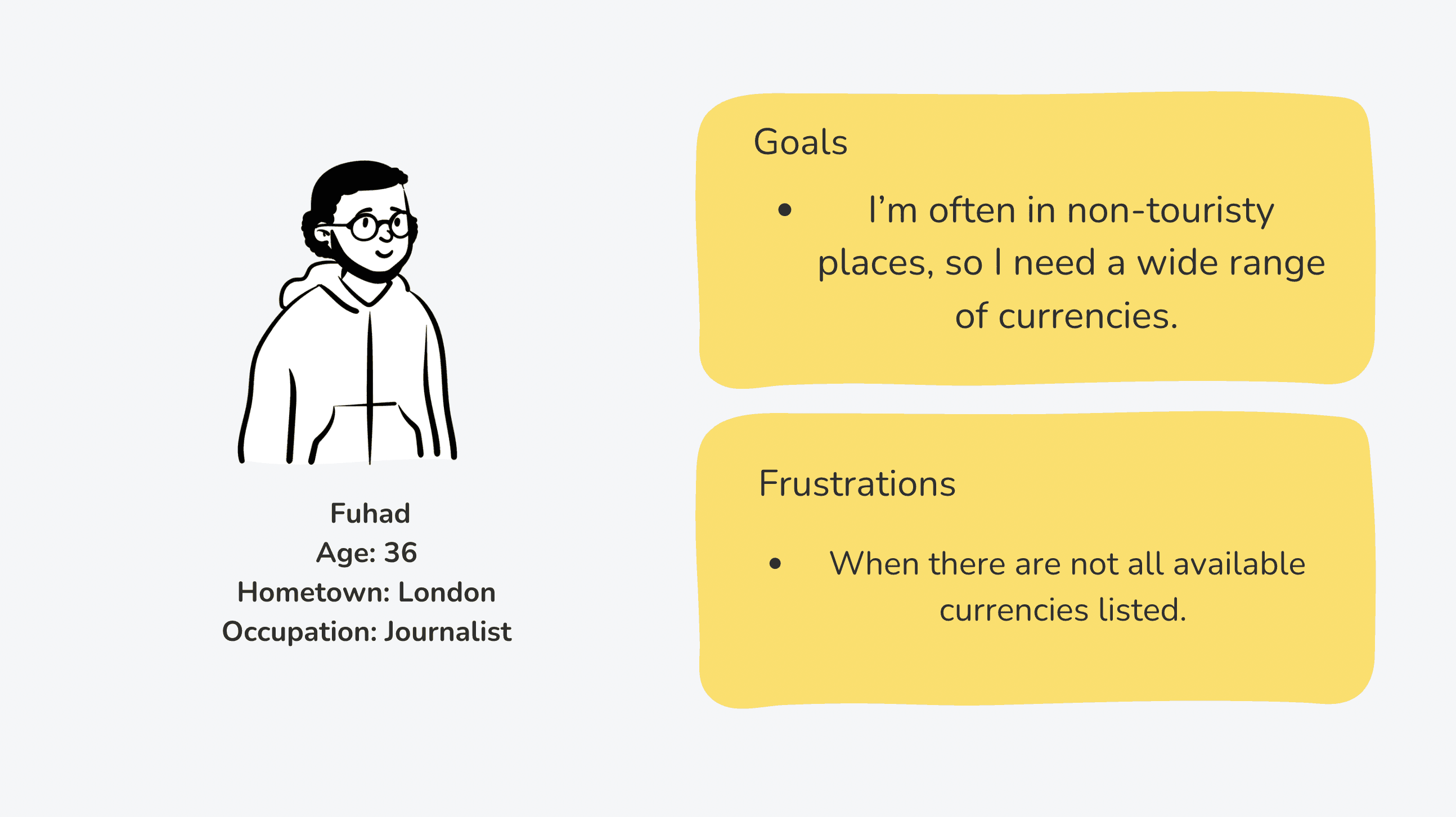
Observations: Users would like a focus on instantaneous results and non-technical screens.
Thinking ahead…
User Pain Points:
Lack of support for multiple currencies.
Outdated Exchange rate data.
Difficulty in finding specific currency information.
How can we 'fix' the problem…
Exchango will provide access to the 180 currencies recognised as legal tender in United Nations (UN) member states to prevent user drop-off rates.
Integrate real-time data feeds from reliable financial institutions to ensure the exchange rates are always current.
Implement a robust search and filter function that allows users to quickly find the currencies they need.
Some things to consider throughout:
What about countries that have more than one currency?
What about dominant currencies?
User Research:
As the currency exchange market is heavily saturated, I began with competitive audits and found that most globetrotters are consistently on the go, always seeking a quick, reliable answer—whether it's for the next flight from San Francisco or, in our case, what €17 converts to in pounds.
For Exchango, I implemented independent surveys to gather structured feedback from a diverse user base. These surveys have been invaluable in providing quantitative insights into the app's usability, understanding user satisfaction levels, and uncovering user preferences.
Take a look:


3 Define
Next, I moved to the drawing board (Miro) and created affinity diagrams, using this space to organize and list everything I learned from my competitive audits.
Affinity diagrams:
Gather 💡
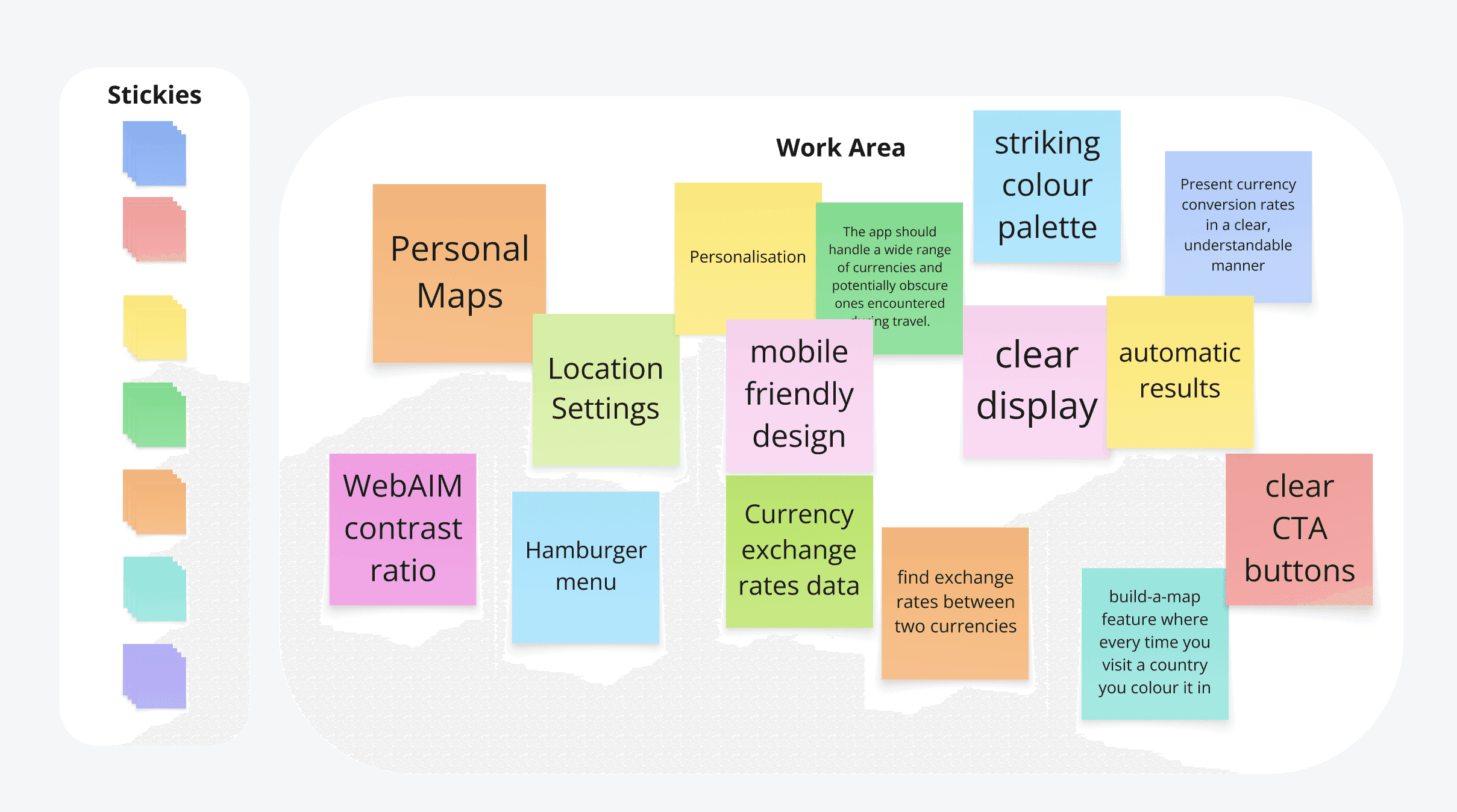
Group 🧳

Define ✏️


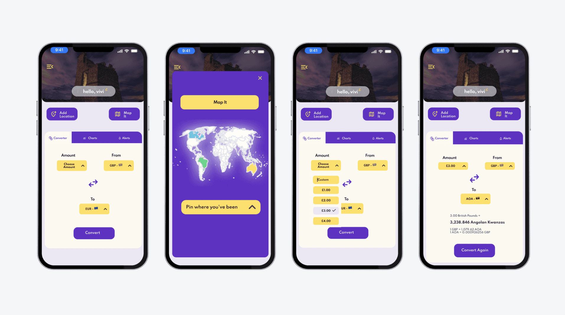
High-Fi wireframes:
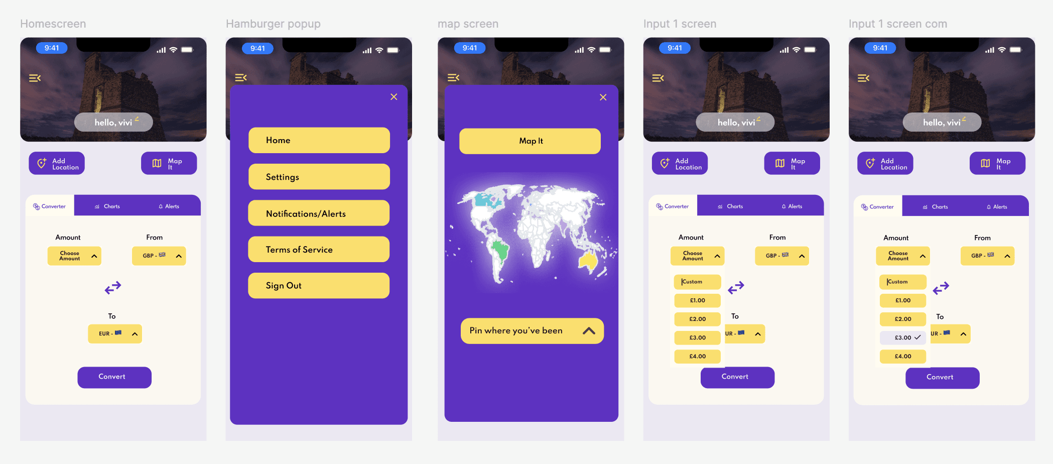
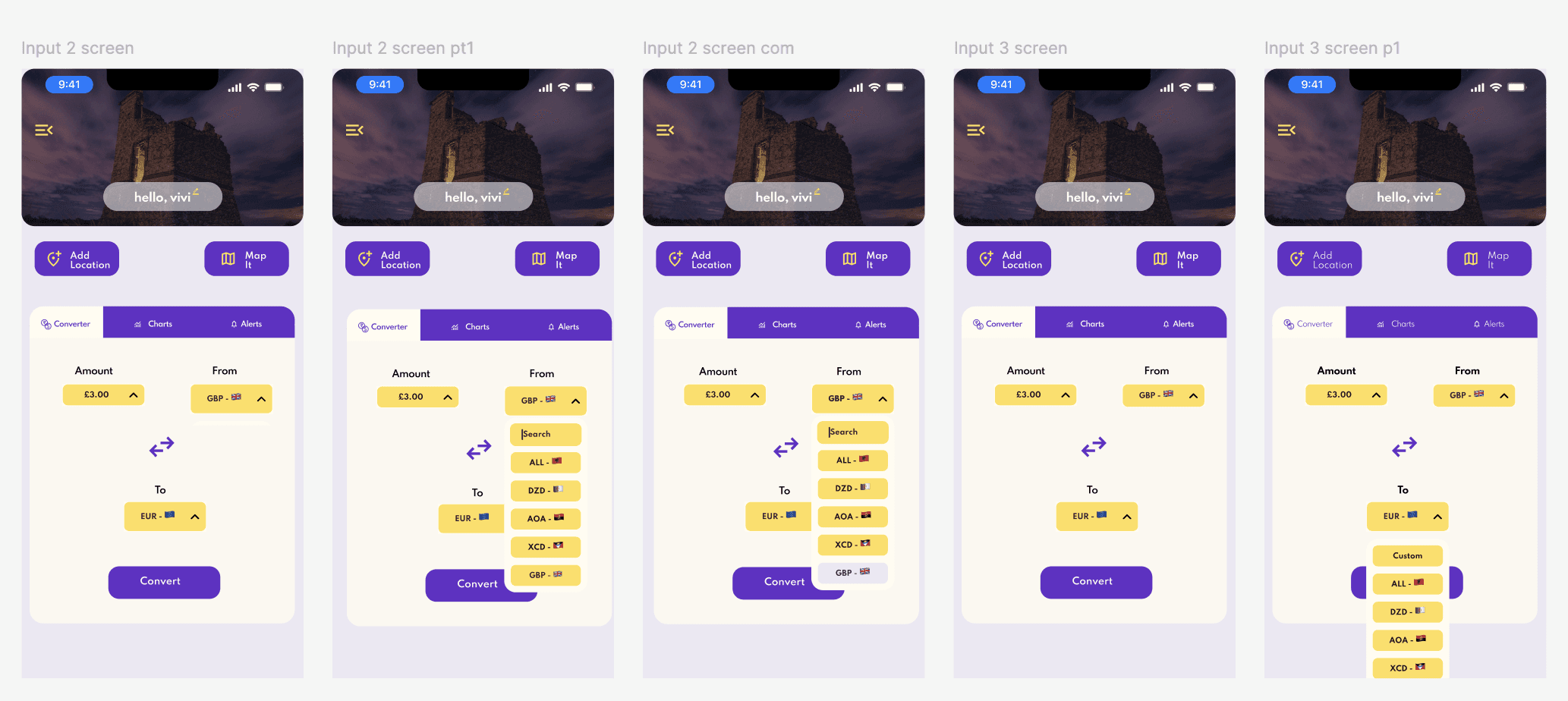

Content Drafting & Testing: In terms of the written word, Exchango features very little. Its main focus is to direct users to choose the amount they wish to convert and the two currencies they wish to know.
However, I did need to consider the content and how it is presented in response to our user research and personas.
User personas and research revealed that users want a broad range of currencies. Not including a wide range of currencies would increase drop-off rates.
What about countries that have more than one currency?
The long answer….
Exchango features the 180 currencies recognised as legal tender in United Nations (UN) member states.
Only currencies that are legal tender, including those used in actual commerce or issued for commemorative purposes, are considered "circulating currencies."
The short answer…
If a currency is in circulation, it will be featured in the Exchango list of currencies.
Considering usability, 180 currencies is a lot. To prevent users from having to scroll and sift through hundreds of currencies, I designed a custom search feature at the top of the drop-down lists for convenience.
What about dominant currencies?
The Euro is the 8th strongest currency in the world and is the official currency of 20 out of 27 countries in the European Union.
However, assuming this is common knowledge would be a disservice to users. For example, imagine you are abroad in the Netherlands and walk into a nearby coffee shop. You want to find out the exchange rate for a cup of coffee to see if you are being overcharged and should go to a different coffee spot. You open up Exchango, type in the price you see for the coffee, type in the Netherlands and the USA, and hit convert. Easy, right? In the process, you also find out that the Netherlands use the Euro (they have since 1999).
Now, imagine the same scenario, but this time, when you type in the Netherlands, nothing comes up because the app assumes you know the currency is the Euro. This would cause too much frustration and confusion for our users and lead to high drop-off rates.
While Exchango takes into consideration dominant currencies, it does not group together currencies.
Iteration:

My independent interviews revealed that users favour bold text in buttons because it significantly enhances readability, contributing to a more cohesive, intuitive and accessible user experience.
6 Testing
In Action:
What I learned
For this project, I had the chance to play around with colours and be creative. Along the way, I learnt how important it is to use WCAG-approved contrast ratios. This makes a big difference in accessibility, helping users enjoy the app without needing to rely on contrast-enhancing tools.
Index