1 Overview
Role: Content Designer, Content Writer, UX Designer
Timeline: 5 months
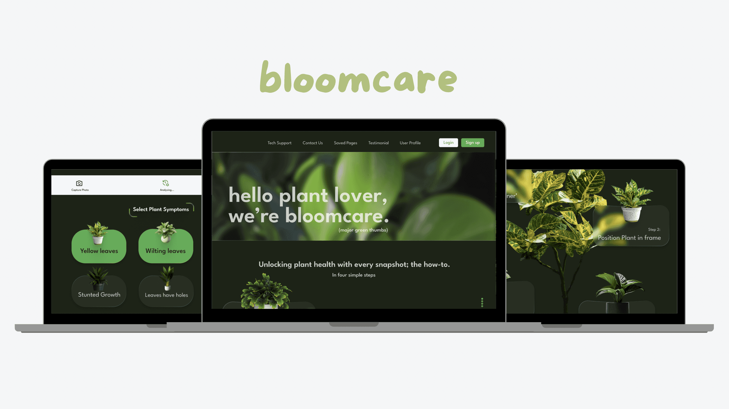
Context: I designed a responsive website and developed UX content to help users diagnose and address issues with their houseplants.
Tools: Miro, Figma, Canva, Typeform, Microsoft Suite
Problem: Users are (typically) not botanists, and can't always figure out why their houseplants keep dying. Are they watering enough? Are they watering too much? This confusion may lead to wasted time (scrolling through numerous blogs to figure out why) and unnecessary expenses (repurchasing the same greenery). How might we quickly and accurately help users diagnose houseplant issues—simplifying the process and saving them from endlessly replacing the same IKEA plant?
Solution: I designed an intuitive and efficient tool that quickly diagnoses houseplant issues, providing clear care instructions.
2 Empathise
Meet the users
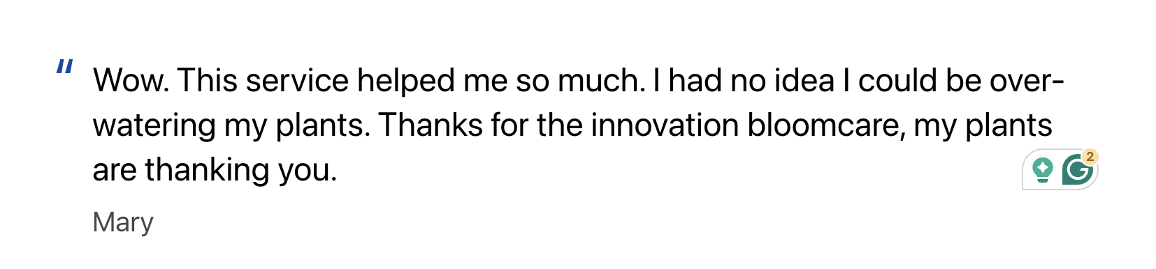
'I have a lot of plants and consider myself a green thumb, but I want to know how much watering each plant needs.' - Mary
'I just moved into a new flat and was gifted a houseplant from work. I want to know why there are yellow spots on its leaves.' - Chris
'I'm a brand new plant parent and would like to know how to keep my plants healthy to save some money.' - Andy
Observations: Users want simple, insightful, and helpful. They don't want bulky, static, and long.
User Pain Points: Here is what I anticipate user pain points will be and how I will avoid them.
Confusion with instructions —> bloomcare's content will provide clear, concise, and visually guided step-by-step instructions to improve understanding and ease of use.
Photo Scan Accuracy—> bloomcare will prompt users to retake the photo if it is too blurry or dark. As a failsafe for users experiencing camera issues or without a camera that takes clear pictures, bloomcare will follow up the diagnosis process with a multiple-choice selection, where users can click on the symptoms their plant exhibits.
Conflicting Information Overload —> bloomcare will summarise collated research and provide preventative tips from top botanists. By organising information into digestible bullet points, bloomcare ensures that users receive relevant and straightforward guidance and solutions
User Research: I utilised interviews, quick polls, and desktop research to learn more about my user personas and their needs and expectations.
I found that potential users for bloomcare are inquisitive, and solution-focused.
Research Questions (for interviews)
Do you own a lot of houseplants?
How frequently do you encounter challenges/issues with maintaining the health of your houseplants?
Do you usually encounter issues with your house plants?
How long does it take for a user to scan, select, and view the results of the plant diagnosis?
To ensure relevancy, I decided that my participants would be houseplant owners with access to a camera (web or mobile).
To ensure inclusivity, the interview will include two males, two females, and one nonbinary individual.
The study is designed to be accessible for use with a screen reader and a switch device.
3 Define
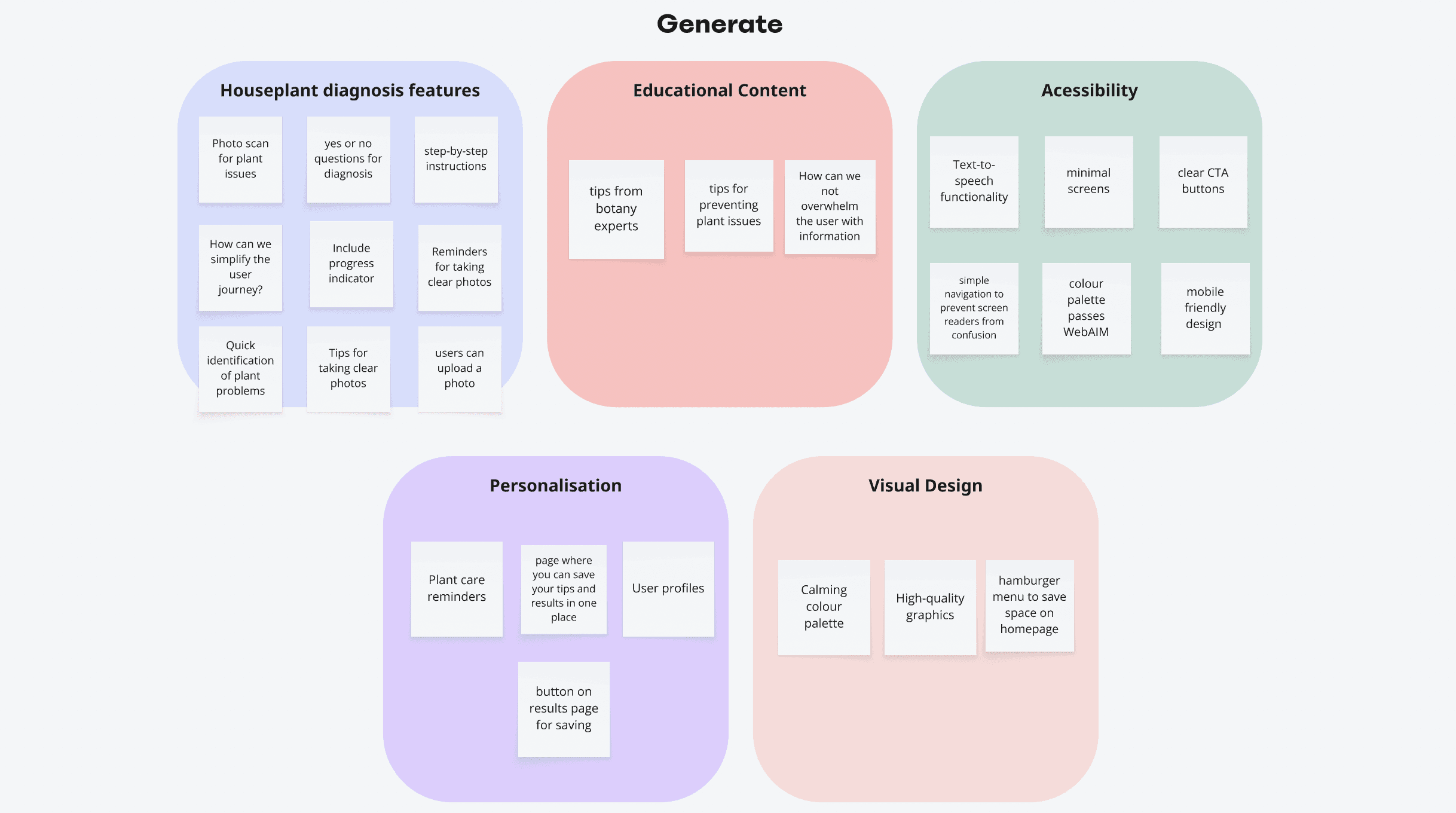
Based on my initial user research and key findings regarding expectations and needs, I moved to Miro to get my thoughts onto (digital) paper.
Affinity diagrams
Step one, Gather 💡
I found that potential users for bloomcare are inquisitive, and solution-focused.
Research Questions (for interviews)
Do you own a lot of houseplants?
How frequently do you encounter challenges/issues with maintaining the health of your houseplants?
Do you usually encounter issues with your house plants?
How long does it take for a user to scan, select, and view the results of the plant diagnosis?
To ensure relevancy, I decided that my participants would be houseplant owners with access to a camera (web or mobile).
To ensure inclusivity, the interview will include two males, two females, and one nonbinary individual.
The study is designed to be accessible for use with a screen reader and a switch device.
3 Define
Based on my initial user research and key findings regarding expectations and needs, I moved to Miro to get my thoughts onto (digital) paper.
Affinity diagrams
Step one, Gather 💡
4 Ideate
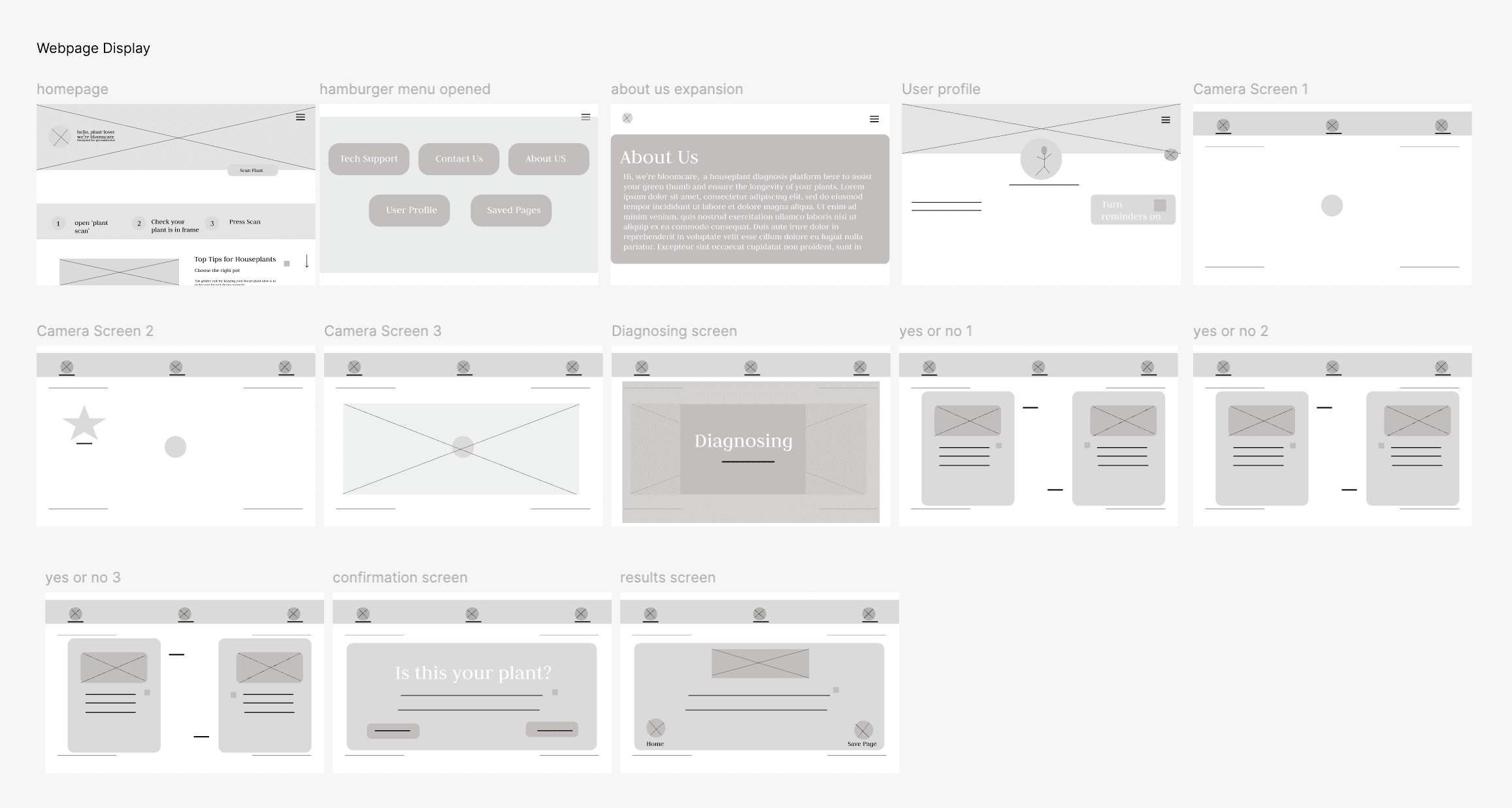
Paper wireframes: I started my design process with 5-minute rough sketches. I then put a star beside the features I liked.
5 Prototype
Let's first establish bloomcare's colour palette and typography.
4 Ideate
Paper wireframes: I started my design process with 5-minute rough sketches. I then put a star beside the features I liked.
4 Ideate
Paper wireframes: I started my design process with 5-minute rough sketches. I then put a star beside the features I liked.
5 Prototype
Let's first establish bloomcare's colour palette and typography.
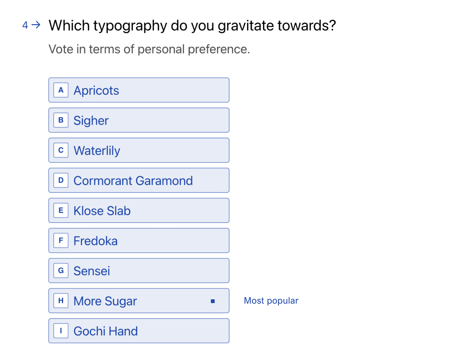
Based on user feedback, I chose the 'More Sugar' script.
I used Colorkit.co to find inspiration for my colour palette.
I used Colorkit.co to find inspiration for my colour palette.
I used Colorkit.co to find inspiration for my colour palette.
*From left to right: HEX: #f0ead2, #dde5b4, #adc178, #a98467 and #6c584c.
When considering accessibility, colour, tone, and contrast become incredibly important. I aimed to avoid overwhelming users with excessive colours, adhering to the 60-30-10 rule. Through iteration, I tested colours against WebAIM's contrast ratio and selected final colours for bloomcare that meet accessibility standards.
My main focus as a designer was to follow the brief provided by Grow with Google (Google UX Design course). bloomcare provides a plant healthcare scanning system, tips from botanists, and the ability to save your results/tips for future access.
I chose not to overload our users or significantly expand bloomcare's services for two reasons.
First, bloomcare's goal at this stage is to accurately assess the health condition of houseplants. Straying from this could confuse users about bloomcare's purpose. Second, I aim to create/write digestible, bite-sized knowledge for bloomcare's users. Introducing too many services may result in information overload, a key dislike for users.
Iterations:
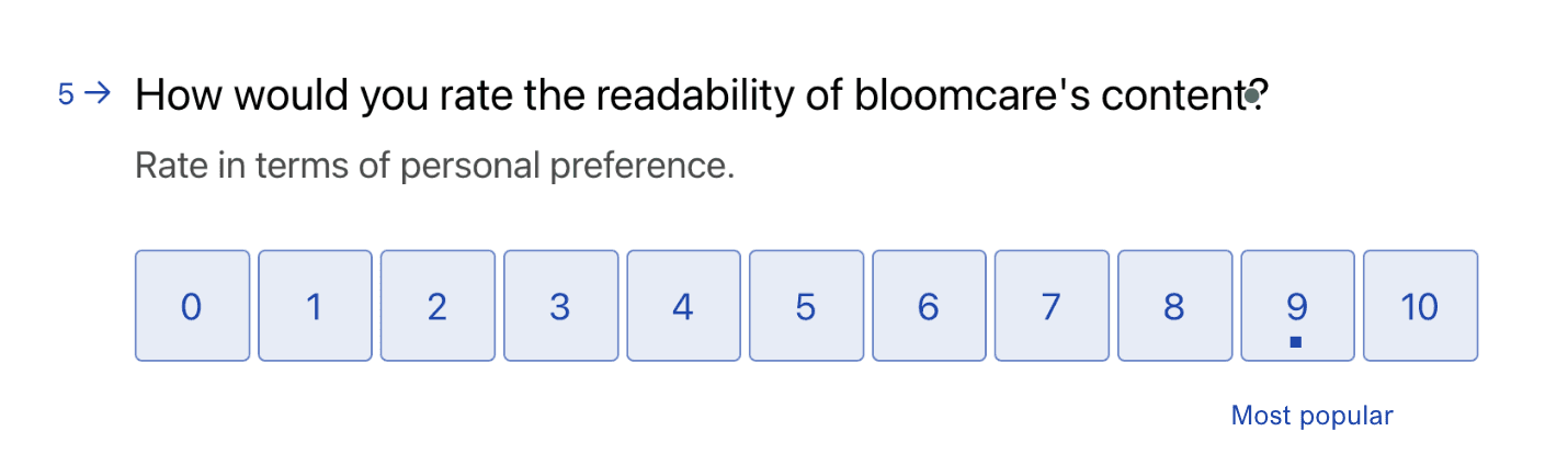
As a content designer, my main priority is the written word. While I continue to learn and grow in all areas of digital design, I specifically focus on improving UI features. In this project, user feedback guided multiple iterations of the homepage, enhancing readability and visual design.
First round of UI adjustments
Iterations:
As a content designer, my main priority is the written word. While I continue to learn and grow in all areas of digital design, I specifically focus on improving UI features. In this project, user feedback guided multiple iterations of the homepage, enhancing readability and visual design.
First round of UI adjustments
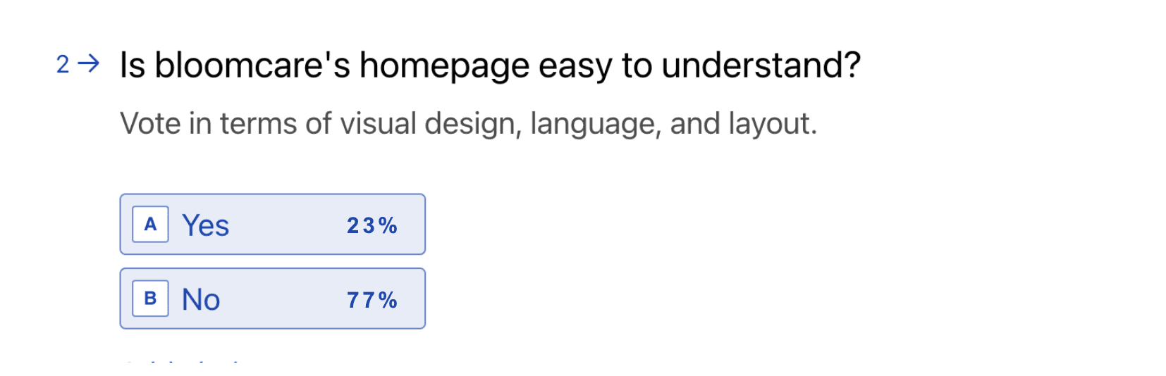
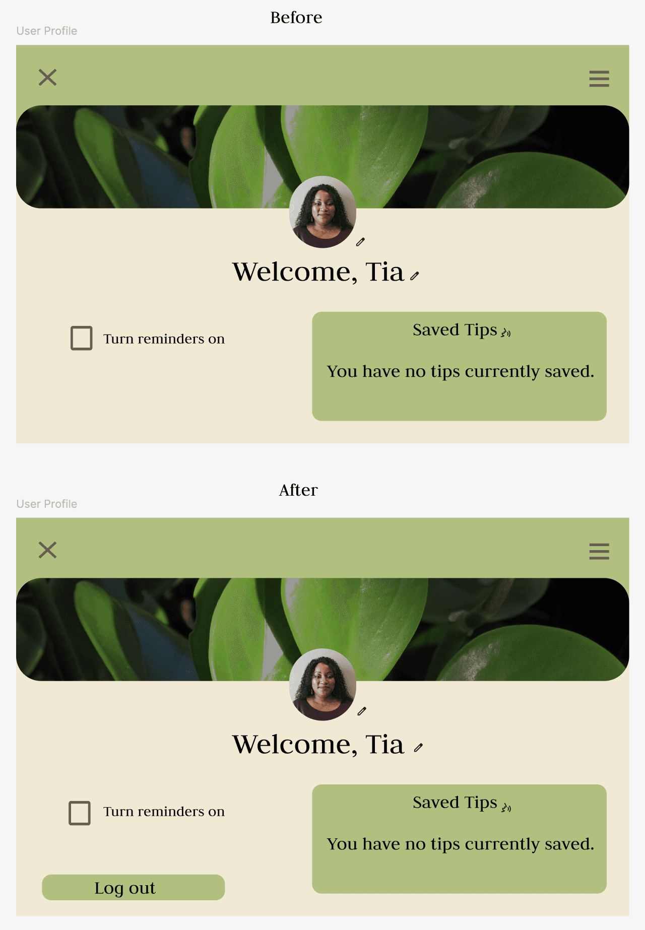
User feedback revealed a preference for clear, visible borders between text sections to improve readability.
Users also found the original button text unclear. I trialled an alternative copy to make the action clearer. In the next stage, I will add a camera icon to the button to increase the clarity of its function.
3/5 users disliked the logo against the high-contrast image. I removed it to tidy up the space.
To ensure my colour choices were WCAG AAA-approved, I ran my colour contrasts through WebAIM and achieved a passing score of 8:89:1
Accessibility Iterations
User feedback revealed a preference for clear, visible borders between text sections to improve readability.
Users also found the original button text unclear. I trialled an alternative copy to make the action clearer. In the next stage, I will add a camera icon to the button to increase the clarity of its function.
3/5 users disliked the logo against the high-contrast image. I removed it to tidy up the space.
To ensure my colour choices were WCAG AAA-approved, I ran my colour contrasts through WebAIM and achieved a passing score of 8:89:1.
Accessibility Iterations
My main focus as a designer was to follow the brief provided by Grow with Google (Google UX Design course). bloomcare provides a plant healthcare scanning system, tips from botanists, and the ability to save your results/tips for future access.
I chose not to overload our users or significantly expand bloomcare's services for two reasons.
First, bloomcare's goal at this stage is to quickly and accurately assess the health condition of houseplants. Straying from this could confuse users about bloomcare's purpose. Second, I aim to create/write digestible, bite-sized knowledge for bloomcare's users. Introducing too many services may result in information overload, a key dislike for users.
Instead of requiring a Google account for sign-in, bloomcare runs on a signed-out mode and collects minimal data. This makes it easy for users who aren't tech-savvy to click and scan without extensive knowledge of technology.
These elements did make improvements, but on my second round of user feedback, comments on the visual design came through.
Second round of UI adjustments
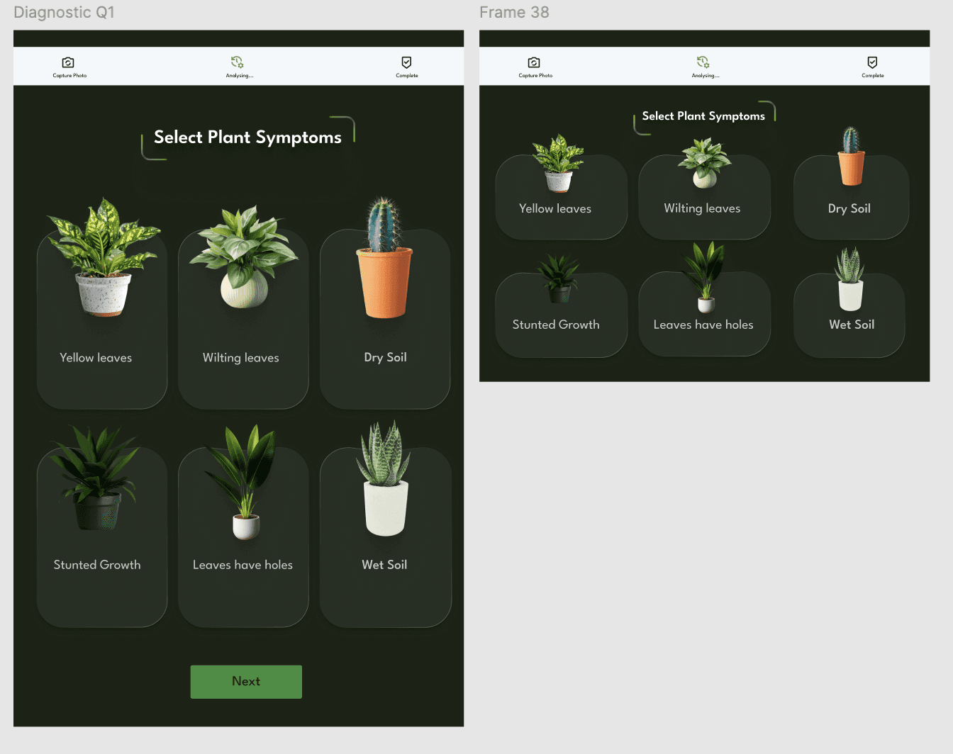
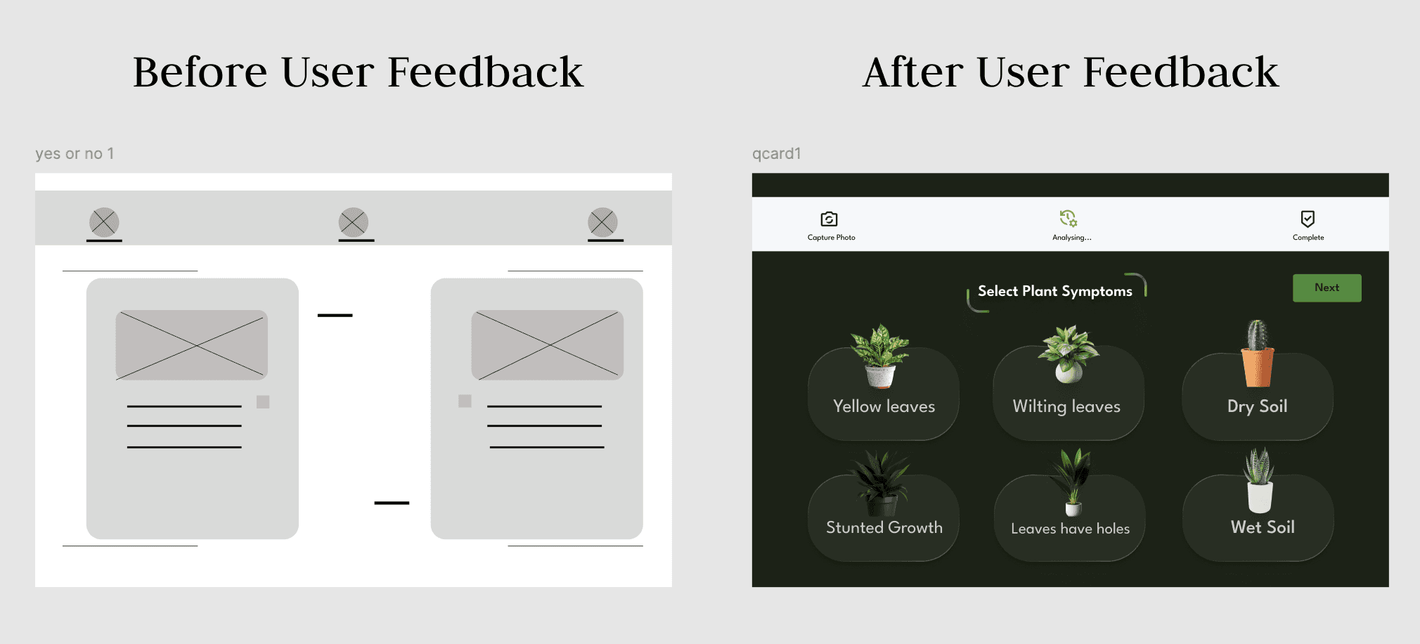
User feedback requested smaller screens and less scroll time.
Users want to get from point A to point B as quickly and accurately as possible, so I adjusted the elements to ensure that there is zero scrolling during the diagnostic screens.
Users want to save time, so I simplified three repetitive screens into one select-card screen, shortening the user journey by an average of 71 seconds.
Takeaways: In this project, I gained a deep appreciation for the value of user feedback and its transformative impact on my designs.
Takeaways: In my content and UX design learning journey, I've come to recognise the value of user feedback —assessing whether users can identify, understand, and find the content useful to their needs.